How to Create Customized Charts Fast with Chart.js
A guide on creating customized charts easily using Chart.js

Today is a big data world, which fulfills all kinds of data to be reviewed and analyzed. The plugin can convert the data to a beautiful chart, such as line, bar, bubble, pie, polar area, radar, and so on. And also it’s easy to customize the details with options. It’s a useful tool for designers and developers.
Basic demo tryout
Step1:
Import chart.js file
<script src="https://cdn.jsdelivr.net/npm/chart.js"></script>Step2:
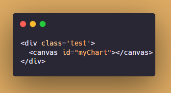
HTML — the chart will appear in the canvas.
Step3:
JavaScript — customize the data and layout of the chart.
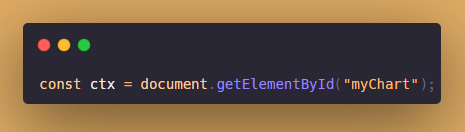
Select the DOM of your chart.
Fire up the library with new Chart().
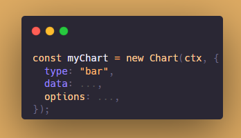
The type can be bar, line, bubble, doughnut, pie, radar, scatter, polarArea.
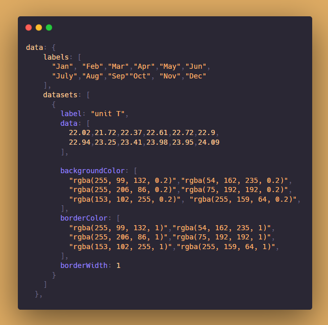
The labels are the array of labels of bars.
The datasets include the label,bar data,backgroundColor,borderColor and borderWidth.
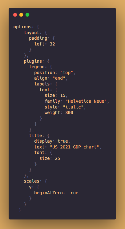
The layout is the layout setting of the chart.
The plugins include the chart label position, font size, etc. And the big title customized. Customized the scales with the y-axis or x-axis.
For more details check the document here:
My demo:
👉Follow me for more useful web development content! Love sharing🥰


