Posts

Showing posts from November, 2017

verify.js---multiple verifying ways with jQuery

Image
Verify.js is a plugin for verifying that users are not robort, which contains five ways such as regular,slide,calculation, puzzle and choosing words in order. GitHub here More documents here Step1: <!--link CSS--> <link rel= "stylesheet" type= "text/css" href= "css/verify.css" > <!--link JQUERY--> <script type= "text/javascript" src= "js/jquery.min.js" ></script> <!--link JS--> <script type= "text/javascript" src= "js/verify.min.js" ></script> HTML: HTML Basic html for five types of verifications. HEAD: HEAD  Link the verify.css file in the head. And a little stylish for sections. Step2: JS link js in body (1)regular panel1.js $('#id').codeVerify({attributes...}); Expaination: attribures explain type default is 1.   width the width of verification code, percentage available height the height of verif

bubbly-bg.js----a beautiful bubbles background---clock desktop demo

Image
Bubbly-bg.js is a  beautiful bubbly backgrounds in less than 1kB (696 bytes gzipped),which is based on HTML5 canvas. GitHub here Step1: HTML This is the clock parts. html Do some stylish on clock to make it center. head Step2: JS It's easy to apply the bubbly-bg.js function with bubbly(); js There are several attributes: coloreStart: the beginning of the color transit colorStop:the end of the color transit(I think it's like gradient()) bubbleFunc: the function of bubbles moving bubbles: the numbers of bubbles showing blur: the ambiguity of bubbles .The bigger the number is, the more blur the bubbles are. compose: the style of bubbles. multiply bubbles. Default is  compose : " light " .The other is compose : " source-over " shadowColor:the shadow color of bubbles The javascrip color js below. More detail expain check  here js for clock See the Pen bubbly-bg.js demo by Yifang Di ( @diyifang ) on C

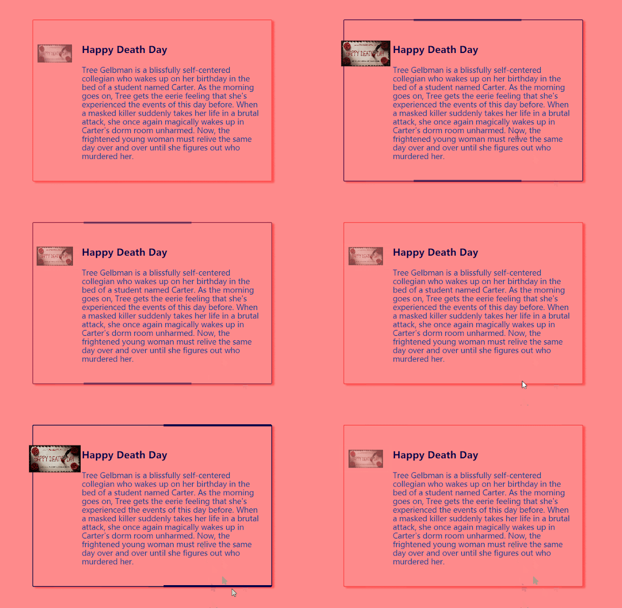
responsive hovering animation example

Image
pc  mobile (max:width960px) This example is  animation effects when hovering the card,which is responsive for pc and mobile.   Step1: HTML html In the box,there are two parts:icon and content which can be replaced by any information. Step2: CSS3 css1  The attribure called display:flex makes the the box in the middle of the page. Given the position relatively ,the box gets border styles. When hovering, the border of box turns color. css2  Then two short lines are from :before :after,and justify their positions. When hovering the box, the two lines slide from left to right with animations,and show from hidden opacity. css3  The icon (image) is fixed at the absolute position at first. When hovered, the image zoom in and show more clear. css4 More considers about mobile application, it's useful to make it responsive. When applying to phone screen size 960px width, the animation and absolute position should be changed slightly. When hov

CSS3 cards hover effect

Image
When the mouse hovers on the card which contains images or paragraphs, the description will slide to top to show the information,meanwhile the image zooms in with animations. This is a demo purly with CSS3. Step1: Link the style.css in the head. head  Step2: HTML The card should be four parts: card_thumb, card_data,card_body and card_footer. All the words in the card_body split to for sections. html Step3: CSS Basic reset for body and link the font-family from google fonts. css1 To make sure the card in the center of the brower. When hovering, the outside of the card should be more box-shadow with animations. css2 The date in the circle at the right corner of the card is placed absolute. css3  The thumb is the image. And when users hover the image, the scale changes from 1 to 1.2,and the opacity reduces half transparent, and the thumb height narrows to half in 0.5 seconds. css4 The description should be hidden at first,so the opacity is 0,an