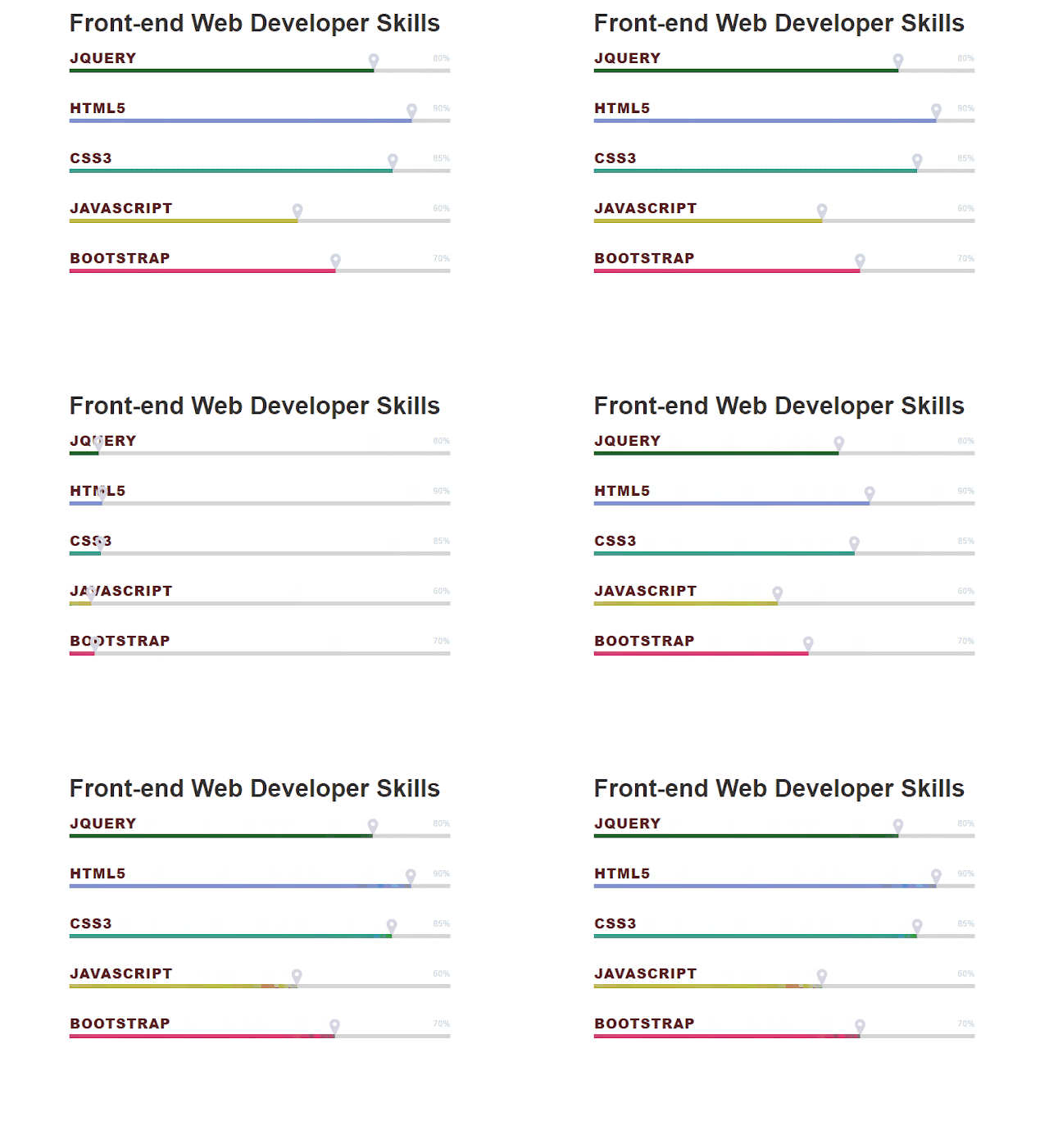
css3 Progress based on Bootstrap
Nowadays, bootstrap is kind of basic skill to be a front-end webdeveloper. But how to make it upgrade is the progressing road on.
Here I will mention about the bootstrap progress functions.
The demo Code:
According to the bootstrap DOM, I build the HTML below.
Every progress should be classed progress and the child bar for progress-bar,which is based on bootstrap.
In this demo,we should link the Bootstrap,Awesome and customer css file. Attention:don't forget link the jquery library,because bootstrap needs it.
Customer the CSS file, the progress title is visible when overflow is visible.
The main point of this demo is how to make the progress-bar animation and hang with icon.
Set an animation called animate-positive and use the keyframes to set it begin from 0% position.
The awesome icon associate with progress-bar using pseudo element. The content value of Awesome reference here.
The largest font-weight is 900 called heavy black. Reference here
In order to make it a responsible site, the media screen is a good way to restyle the font-size and width and so on when the site is narrowed or for phone users.
Here I will mention about the bootstrap progress functions.
Progress components are built with two HTML elements, some CSS to set the width, and a few attributes.
- We use the
.progressas a wrapper to indicate the max value of the progress bar. - We use the inner
.progress-barto indicate the progress so far. - The
.progress-barrequires an inline style, utility class, or custom CSS to set their width. - The
.progress-baralso requires someroleandariaattributes to make it accessible.
The demo Code:
According to the bootstrap DOM, I build the HTML below.
Every progress should be classed progress and the child bar for progress-bar,which is based on bootstrap.
In this demo,we should link the Bootstrap,Awesome and customer css file. Attention:don't forget link the jquery library,because bootstrap needs it.
Customer the CSS file, the progress title is visible when overflow is visible.
The main point of this demo is how to make the progress-bar animation and hang with icon.
Set an animation called animate-positive and use the keyframes to set it begin from 0% position.
The awesome icon associate with progress-bar using pseudo element. The content value of Awesome reference here.
The largest font-weight is 900 called heavy black. Reference here
In order to make it a responsible site, the media screen is a good way to restyle the font-size and width and so on when the site is narrowed or for phone users.


